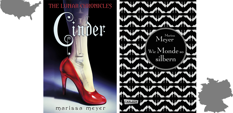
The first time I saw the US cover of Cinder, I was instantly drawn to it. The red heel is so striking, it immediately draws in the eye. Add on the X-ray view of the leg, which reveals mechanical parts rather than bones and it is bound to attract attention.
The German cover somewhat confused me at first because I wasn’t sure what to make of it. It looked dated to me because of the repetitive pattern that covers the entire book. The title also doesn’t exactly point to Cinder(ella) with Wie Monde so silbern (As moons, so silver).
Comparison
Similarities
Upon taking a closer look, you will realize that the pattern of the German cover consists of heels. Those are not random zig-zags printed to satisfy the whims of the book cover designer. This brings me to the similarity: heels! Straight away I thought of Cinderella. How could it not allude to Cinderella?
After all. the one familiar story where heels matter so much is Cinderella. Coupled with the title Cinder for the English version, the allusion is very clear. For fairytale retellings, such an indication is key and both the US and the German covers delivered on that front.
Differences
Clearly, the difference lies in the repetition on the German cover versus the central object on the US cover. The repetition on the German cover, as I said, comes off as old-fashioned. However, when you consider that this is a fairytale retelling, that design choice is a brilliant one. It is reminiscent of old books that didn’t have particular cover designs but rather were covered with patters.
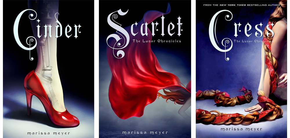
At the same time, the US cover is very striking, while the German cover is very understated. The US covers for the entire Lunar Chronicles series play on the colour red. (Well, at least the covers of Cinder, Scarlet and Cress do.)
The Actual Story
In terms of the story, I don’t think there is much to be said. Both the US and German book covers allude to Cinderella through the heels. The US cover of Cinder though, takes it one step further. The mechanical parts made it rather clear that a cyborg would be part of the story. It thus demonstrates the futuristic elements.
The German cover on the hand is much more timeless. It could very well be a cover for Cinderella or Ashputtel. I don’t think it necessarily demonstrates that there is more to the story than the Grimm’s fairy tale so many of us grew up with.
Style
Style-wise, the US cover looks a lot more like it was geared towards young adults. I believe that the bold red and the mechanical parts are much more likely to grab the attention of the intended audience.
To me, the German cover looks more like it was geared towards adults rather then young adults. The design isn’t as striking but instead seeks to elevate the books to the same regard as classical books with a more classic design.
The Chronicles as a Whole

US book covers, The Lunar Chronicles
Both the US and German versions have their themes. The US covers feature elements of the fairy tales they’re based on. For Cinder that’s red the heel, for Scarlet the red cape and for Cress the long hair with a red ribbon. This adds red as the connecting accent colour as well, thus making it clear these books belong together.

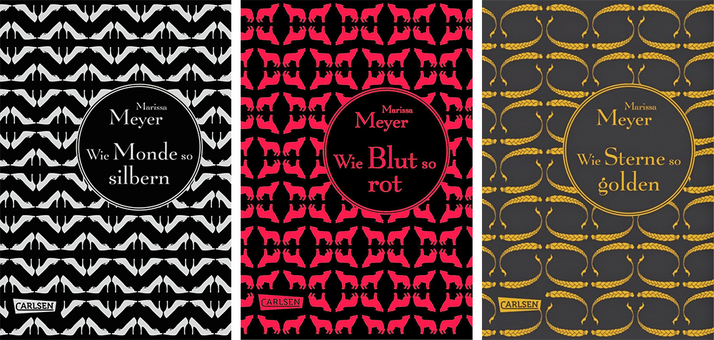
German book covers, Die Luna-Chroniken
For the German translations, the titles are Wie Monde so silbern, Wie Blut so rot (Like blood, so red) and Wie Sterne so golden (Like stars, so golden). The running theme is the repeated pattern of the symbols that represent the fairytales; heels for Cinder, wolves for Scarlet, braids for Cress. The base colour is dark and sets off the contrast of the silver heels, the red wolves and the golden braids.
As a series design, both languages have designs that strongly convey the unity of the books. These books don’t merely have similar looking covers but instead focus on stylistic representations that were applied across the board.
Thematically, I maintain that the German covers edge out the US covers. Even though they didn’t have such a strong initial impact on me, my appreciation for them has grown vastly. Another neat thing is that the book cover designs tie in directly with the book titles.
Personal Preference
Looking at the design on the screen alone, I’d say US book covers. However, the finishing of the German books is a lot more stunning than the design on the screen lets on. (You can take a look at the first three books and below the book jacket.)
As much as the US covers grabbed my attention first, in the end the German book covers won my heart for the craftsmanship and the strong concept that underlined the book cover designs. In fact, the German covers made me completely ignore that they are hardcovers. I hugely prefer paperbacks but in the case of the German translation of the Lunar Chronicles, I would seriously reconsider my stance.
At the same time, I still love the US version for how the design effectively roots the bygone times of fairytales surely in the future. Even the title is set in Gothic script and yet the typography comes with a twist which makes me think of the future.
Your Vote
[yop_poll id=”8″]

I’ve never been a HUGE fan of the US covers, to be honest. There’s just something about the animation that I don’t really like.
I wasn’t enamoured with the German cover for Cinder, until you pointed out that they are heels! And now I am in love. And the other books in the series are so gorgeous, as well! Now I kinda wish I read German, so I would have an excuse to buy those covers. They are really gorgeous.
Learn German! ;D Times like these make me wish I could pick the exact cover I like in a language I read, even if it was originally intended for a foreign language. Too bad this isn’t an option.
I do admit I see your point and where you are coming from in that the US covers are more geared to appeal to the YA crowd and the German ones are more likely to appeal to adults. But I know that in the US these would be shelved in the YA section hence the reason for the covers. It’s sad that they might not grab an adult’s attention if it were say laying on a display rack but you know while I do like the understated quality of the German covers I still prefer the US covers because I’m drawn to the art of it.
In Germany Cinder is shelved under YA fiction as well :) But maybe it’s supposed to draw the older YA reader *shrugs* There seems to be a general trend towards more “mature” designs for YA books, which parallel the designs of adult books. As more and more adults read YA, the less distinction there is in the style of design, I guess. I’ve seen so many YA books that I mistook for adult books and vice versa because of this.
I didn’t even notice that the German covers were little heels until you mentioned it! I strangely enough, really, really like the German covers. They remind me of the Penguin Clothbound editions. Very pretty and like you said, timeless. I could see them on my shelves, except the fact that…you know, I don’t speak German or anything. The US covers are pretty as well, I suppose. They’re dominant, with the red and all which is nice!
Looks like hardly anyone would’ve noticed those heels if I hadn’t pointed them out. Haha. Such attention to detail lost on the masses. Such a shame. Hahaha.
Not sure which cover I like more. I didn’t notice the german cover featured heels until you pointed it out! Now that I know that I think it’s actually pretty well done, what looked like black and white zigzags suddenly makes sense. I do agree that the german cover seems to mis the traget audience a bit, although maybe in german these type of covers are more normal? They do have a very different cover style from what I’ve seen. The Germans cover doesn’t add anything else like the US cover does, which points to the cyborg parts as well, but I do like the simple concept. I never really liked the cover for Cinder for some reason, it just looked a bit borign and with the empty background and the almost creepy cyborg parts showing through the skin it never appealed to me.
Yeah, the German cover takes a while to get used to. I didn’t notice the heels at first either. But when I did, I couldn’t look away. Hmmm. I’ve not seen any recent YA books published in German that have similar covers to the German edition of Cinder. I like the creep-factor of Cinder. The idea of a cyborg is what convinced me to finally read Cinder last month. Lol.
I’m really partial to the US covers, but I definitely appreciate the German ones for the reasons you listed. They do give that older effect so it’s more classic. But the repeated patterns kind of give me a headache, and I had to really focus to make out the shapes. In the end it’s the US covers for me still :D
Haha. Yeah, most people think it’s just zig-zags on the German covers. Takes a while till realization dawns that those are heels.