Ruby Red is a book I that I listened to in German because I wanted to try out the audiobook function in the Onleihe app using my iPhone. The thing with Onleihe (German ebook lending platform for libraries) is that audiobooks can only be downloaded on Windows because the files are WMA.
Since I’m a (happy) Mac user, I wasn’t able to listen to German audiobooks for the longest time. Then when I discovered the streaming option, I gave it a go. It all worked out and I ended up loving Ruby Red.
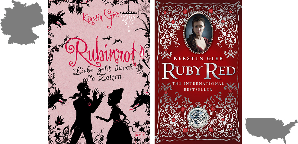
Comparison
Similarities
Besides the title Rubinrot literally meaning ruby red and the author’s name, I don’t see any similarities in the German and US book covers at all. Hard to believe they contain the same book, save for Ruby Red being the translated version.
Nonetheless, I think that both convey a setting in the past. The silhouettes bear clothes that are from the pre-20th century, which is accentuated by the chandelier on the top right corner. The style of the portraiture on the US cover also seems to date back to the pre-20th century.
Differences
The differences lie in the entire book covers. The German cover is pink and fully illustrated, while the US cover is red and made up of mixed elements. Most immediately, the framed face draws attention as it is set amidst the adornment of precious stones. Below the title, the US cover also bears a chronograph.
The Actual Story
Both covers do represent elements of the story. Ruby Red revolves around time travel in London between the 18th century and contemporary times. The US cover conveys it better though with the chronography, thus pointing to the importance of time. The chronograph is also very significant in the story itself, so the US cover is more representative of the actual story, in my opinion.
I also wonder what’s up with those creatures (wolves? dragons?) and bats along the border of Rubinrot. I don’t recall coming across mythical creatures or animals in general. Neither is the book scary on any level, so there’s that.
Style
To me, the German cover comes across as rather chaotic. Chaos and Ruby Red do fit together to some degree but chaos isn’t exactly what underpins the book. The illustration and font also make me think of Rubinrot as a middle grade rather than young adult book.
In contrast, the US looks much more regal to me. It makes me think of royalty, or in the very least, aristocracy. There’s no queen in Ruby Red but for some reason, one of the characters keeps being called “princess” by her companion, so perhaps there is something to be had after all?
Personal Preference
I have a thing for classic designs. Simply because of that, I prefer the US book cover. It also gives a better sense of what the story is about, in my opinion. The German book cover after all, isn’t what led me to read it in the first place. It just happened to be available to me at that point in time.
Your Vote
[yop_poll id=”9″]

I have to say that I don’t like either of these covers. D:
The German cover is kind of creepy, and like you said: chaotic. I’m not a huge fan of the illustrations, and I don’t think that I would pick up this book based off seeing that cover.
But the US one seems really stuffy to me. And quite boring. If I saw it in a line-up covers, I wouldn’t gravitate towards it.
I’m a cover snob, through and through ;D
I’m a fan of the US cover as well! I think it’s because I like the colours of the trilogy TOGETHER. They just look amazing. You’re right though, the German cover’s a tad too chaotic for me. And the fact that it’s pink kind of puts me off haha
I love both of them, they’re precious. If you see the spanish versión, you gonna have a heart attack.
I really like the German one, because I have such a soft spot for covers in that kind of style. I like the illustration style. :D I know you said it feels chaotic, but it feels cleaner to me because the use of silhouettes.
I have to admit that the US cover is pretty cool too! *_*
I like the German one better, even though I find it a bit childish. It’s because I don’t like it, when there is a face on the cover. I like having an idea, but not a Picture because I easily identify the People on the cover with the characters :/
And I nearly forget about the princess part. Makes me sentimental :)
Greetings.
I prefer the German one, I like the scissor-type cover, because that’s quite an unusual design. However, I have to admit that I didn’t really like the whole series.